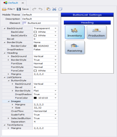
Themes: ButtonList

This sets the look and feel theme for the ButtonList control.
Since the buttons are objects contained on a page, the BackGround, Bevel, BorderStyle and DropShadow properties are used to stylize the page (screen behind the buttons).
The ListOptions property group is used to stylize the buttons, set the parameters of images if any are assigned to the buttons in the designer, and set the spacing between buttons. For example you can set the images/icons in the button container as 16 x 16 pixels, and set the text to scale dynamically when the button size changes.
The Heading property controls the page's header (top of the page).
The TextOptions property group - sets the values for the icon names (captions) in a button/tile. The Margin is the distance between text and the edge of the icon container. ScalePoints reduces the size of the text by the factor supplied. For example ScalePoint 0 or 1 sets the text default size; 2 makes the text 2 times smaller then the icon size. ScaleText, if set to True enables scaling of text; False prevents it from being scaled (reduced).
See Graphical Control Property Definitions topic for descriptions of individual properties.